Spotify UXR Case Study
And Introducing possible solutions.
Through UX research, I evaluated Spotify’s interface for playlist management and social interactions. Leading 12 user interviews and usability tests, I found a SUS score of 53.13, well below the 70 benchmark. To address gaps in discoverability, social engagement, and music exploration, I proposed three targeted feature enhancements.

Metrics of current Spotify interfaces after UXR Research
Problems Identified
From our primary research there were the following issues identified:
Lack of feature visibility for social features
Difficulty navigating and discovering new music and
Recommendations felt repetitive or misaligned with user preferences.
“I’ve never explored this before.”
- User while doing social features related task
Identifying The Problem
Interviews:
A total of 12 participants were interviewed and observed for the data collected. For this evaluation, the intended users of Spotify were college students, typically between the ages of 17-26. Some participant demographics are: 50% Male, 50% Female, International Students, Premium and Free plan users.
Feedback from students provided valuable insights into how Spotify could enhance its music discovery feature to better reflect diverse preferences. Participants had between 3-11 years of Spotify usage, across devices like smartphones, tablets, and computers.

Affinity Mapping:
Through affinity mapping of interview responses, we identified key frustrations: users often discovered music outside of Spotify, faced tedious playlist organization, and found social features underutilized.
This led to our hypothesis: Music discovery is hindered by hidden or hard-to-access features within the interface.


⚠️
Pain Points
 Discoverability of Music
- Repetitive music reccomendation
- Algorithm's learning curve seems steep since song suggestions are repetitive.
- Mobile interface lacks clear access to audiobooks
Playlist Management Issues- Confusing navigation for downloading music and slow content loading.
- Lack of previews complicates playlist management.
- Poor playlist management options on mobile devices
How Might We?
Think Aloud Observation
We designed three observation tasks aligned with our How Might We's:
Find a new song via recommendations.
Add that song to an existing playlist.
Group songs from the same album.
Our findings showed stark contrasts between users familiar with social features and those who weren’t, with some users unable to complete tasks efficiently due to lack of feature visibility.
Validating Our Findings
Following the Think aloud Observations we conducted data analysis where we used UX methods such as SUS Scoring, Probability of Detection, and Confidence interval to analyse and validate our findings from the observation testing.
Key Metrics
Based on the results from the data analysis, we can be 99% confident that this application has an average score lesser than the industry score of 70.
There is not enough evidence to conclude that this interface's perceived usability is high, with a mean SUS score greater than 70. In fact, the mean SUS score of 53.13 is significantly lower than 70, indicating that the usability might need improvement.
53.13
17.84
-3.72
SUS
Standard Deviation
T score
How I Solved It
AI Featured Discoverability
Issue: Users found the Spotify recommendations algorithm repetitive causing discovery fatigue. Users currently tend to find new songs through other social media apps such as TikTok or Instagram. The users mentioned how they might prefer being able explore and discover new songs through Spotify itself.
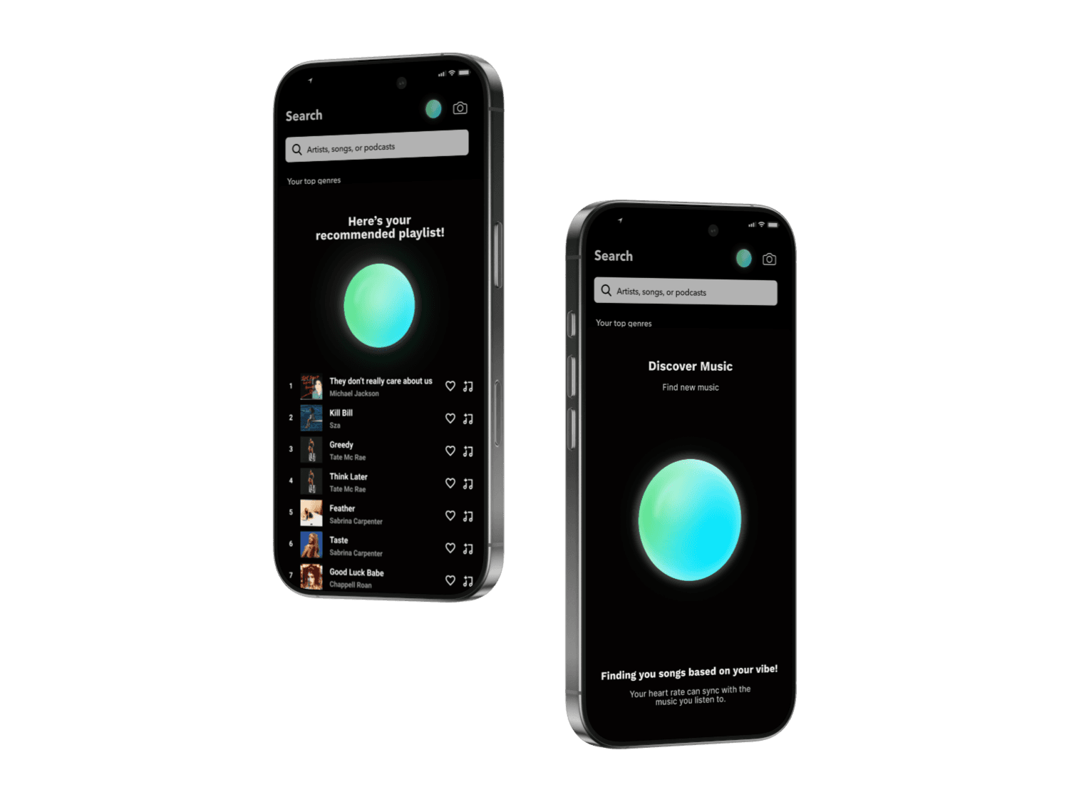
Solution: Introducing a feature that asks the user a series of questions such as, "What are you in the mood to hear?", "How do you want to feel", and uses the responses to suggest songs to the user. This also includes, asking questions that allow users to discover new artists or discover new songs from liked artists, so that the responses can also alter the algorithm.
Because You Liked: Clearer Song Explanations
Issue: Users found the Spotify recommendations algorithm confusing causing discovery fatigue. Users were unsure why some songs or podcasts were being suggested to them.

Solutions: Add a section, 'Because you liked' below the 'Made for you' playlists explaining how their listening history is being used to suggest certain songs. This will help users understand why they are bing recommended certain song.
Clear And Easy To Access Onboarding
Issue: Our study revealed two types of users, one type engaged with the users and wanted to interact with the social features while the others wanted t a personal listening experience. Either user groups weren't able to perform as desired during the observation tasks.


Solution: Given how different users interact with Spotify, there is an opportunity to offer a more customizable experience. For example, some users could be given the option to streamline their UI, focusing on personal playlists and music discovery, while other users could prioritize social features and friend activity.
Key Takeaways
This project helped me understand how UX research goes beyond just interviews and observations. Using metrics like SUS scores and confidence intervals taught me how to quantify user frustration and usability, which made our insights stronger and directly informed the design decisions I made.
One of my key takeaways was designing a contextual tutorial instead of a traditional onboarding. Knowing that users often skip onboarding, I focused on delivering support only when it’s needed, ike when they try to find friends or explore social features. This helped me realize how important timing and relevance are in making help feel useful.
Collaborating with a team of five also taught me the importance of clear communication and coordination. Working together on such an in-depth project strengthened my ability to navigate group work, divide tasks effectively, and stay aligned from research to design.